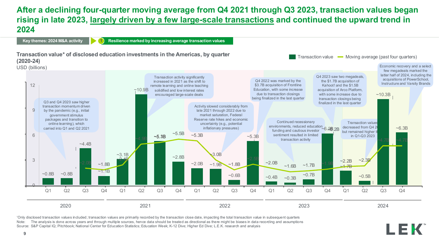
Quarterly value trend with moving average
The same tabbed section layout carrying a donut chart with a centred percentage on the left of the content area and a two-category horizontal bar comparison with a gap callout on the right. Use it to pair one overall share with the cohort that skews it.
Source: Recreated as a native, fully editable PowerPoint slide from page 14 of AI at Work 2025, a publicly published BCG deck. Not affiliated with or endorsed by BCG.
More like this