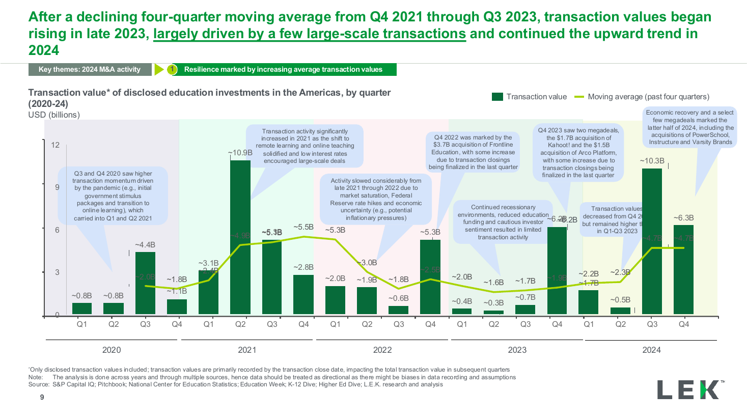
Quarterly value trend with moving average
The third page of the tabbed section, pairing a statement panel with a grouped horizontal bar chart that compares two conditions across three statements, each row annotated with its percentage point gap. Use it to show how one variable changes several outcomes at once.
Source: Recreated as a native, fully editable PowerPoint slide from page 15 of AI at Work 2025, a publicly published BCG deck. Not affiliated with or endorsed by BCG.
More like this