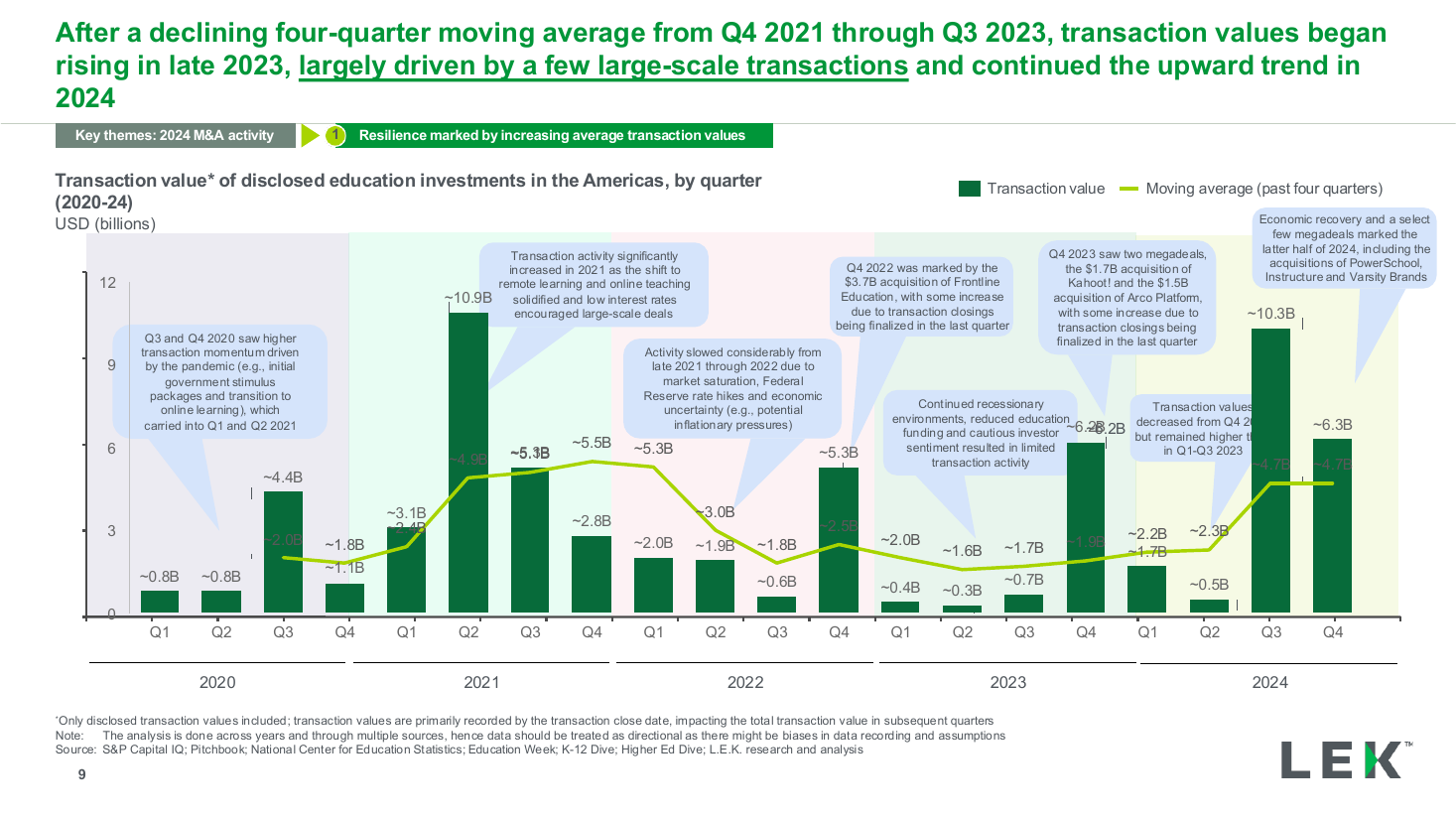
Quarterly value trend with moving average
A statement panel beside a grouped horizontal bar chart that compares two respondent groups on two opposing statements, one gap annotated as a gain and one as a decline. Use it to show that familiarity or exposure flips an opinion.
Source: Recreated as a native, fully editable PowerPoint slide from page 25 of AI at Work 2025, a publicly published BCG deck. Not affiliated with or endorsed by BCG.
More like this