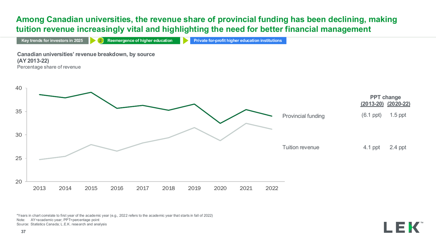
Canada university revenue source dual line chart
A line chart with markers comparing the same cumulative distribution in two survey years, with every point labelled and a leader-line callout explaining the shift, set beside a full-height photograph. Use it for a year-over-year curve comparison.
Source: Recreated as a native, fully editable PowerPoint slide from page 18 of Stablecoins in Focus 2025, a publicly published EY-Parthenon deck. Not affiliated with or endorsed by EY-Parthenon.
More like this